I am a Visual Journalist at The Economist, working on data graphics, visual
investigations, election forecasts and conflict tracking and a researcher in
GIS.
My background is in photography and my interests are in remote sensing,
computational journalism and satellite imagery. Currently I'm also studying
a MSc in Geographic Data Science and building
Semblance Geospatial.
Previous associations and collaborations - UCL Multimedia Anthropology Lab,
Campaign Lab (Newspeak House), g0v.London, Joya AiR, Stallan-Brand
architects
Selected Projects

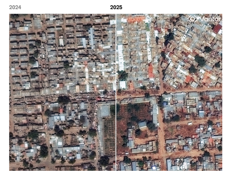
Seen from above, el-Fasher is a ghost town
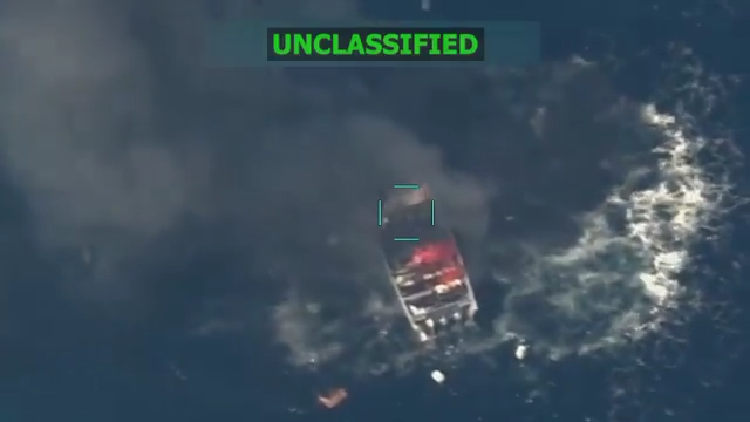
Tracking US military off the coast of Venezuela
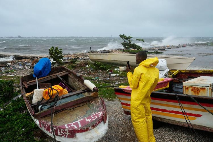
Tracking Hurricane Melissa
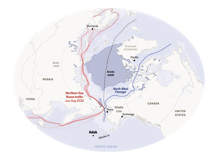
The icy cold war America is busy losing

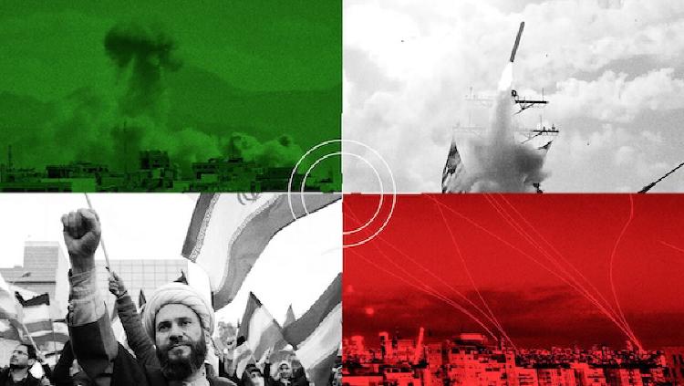
The next phase of the Middle East war

Semblance Geospatial
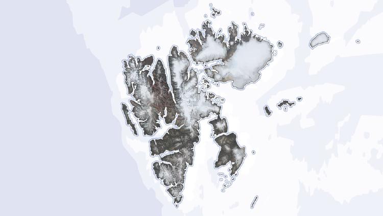
The looming military threat in the Arctic

US immigration detention footprints
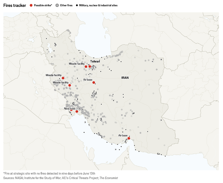
Israel-Iran war tracker
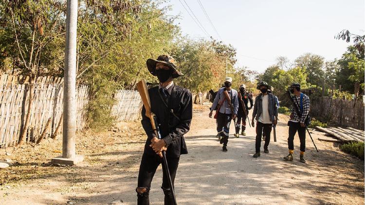
China calls the shots in Myanmar's civil war
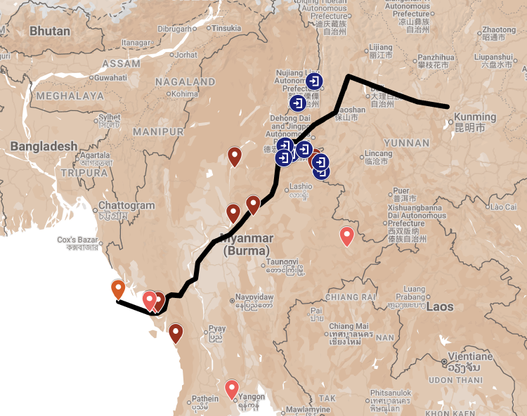
China projects and infrastructure in Myanmar map
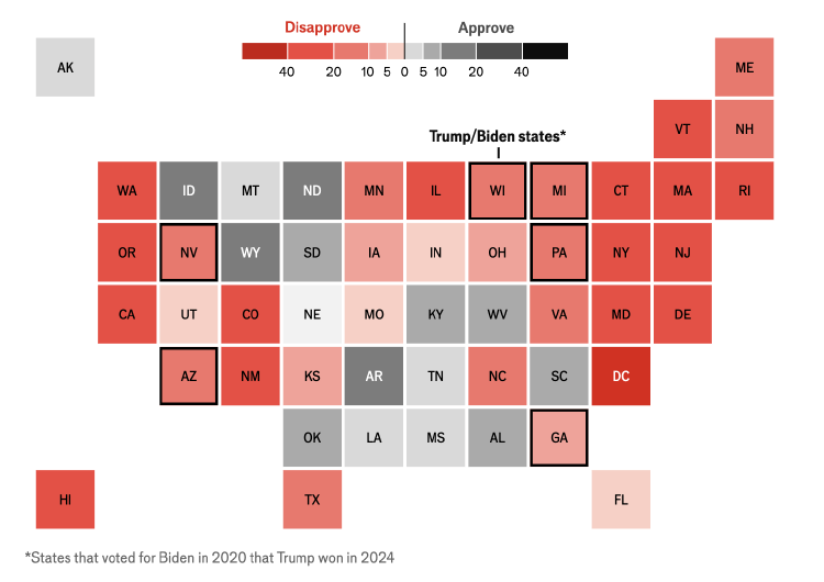
Trump approval tracker
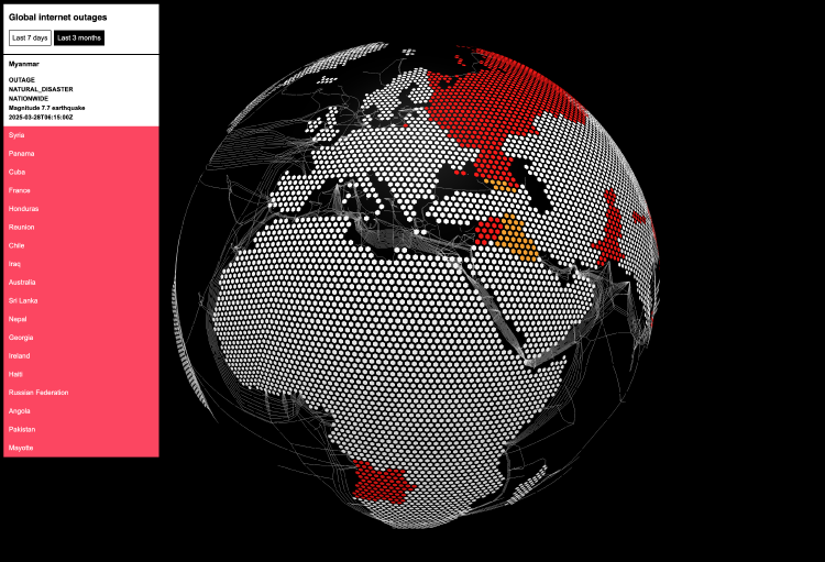
Global internet outages map
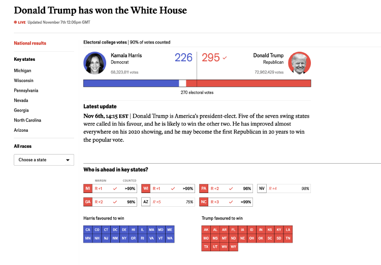
The Economist US election results
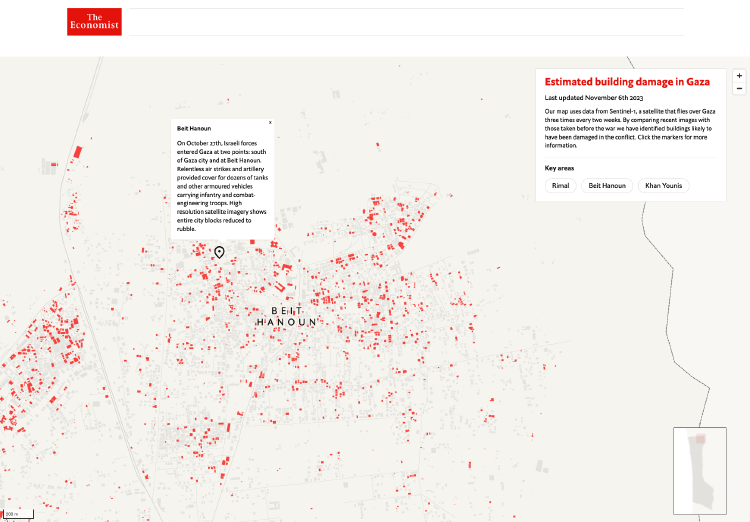
Estimated building damage in Gaza
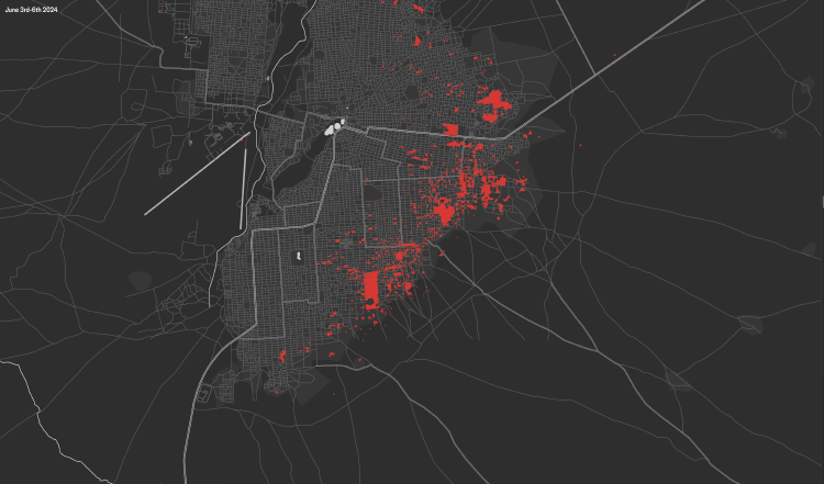
“Hell on earth”: satellite images document the siege of a Sudanese city
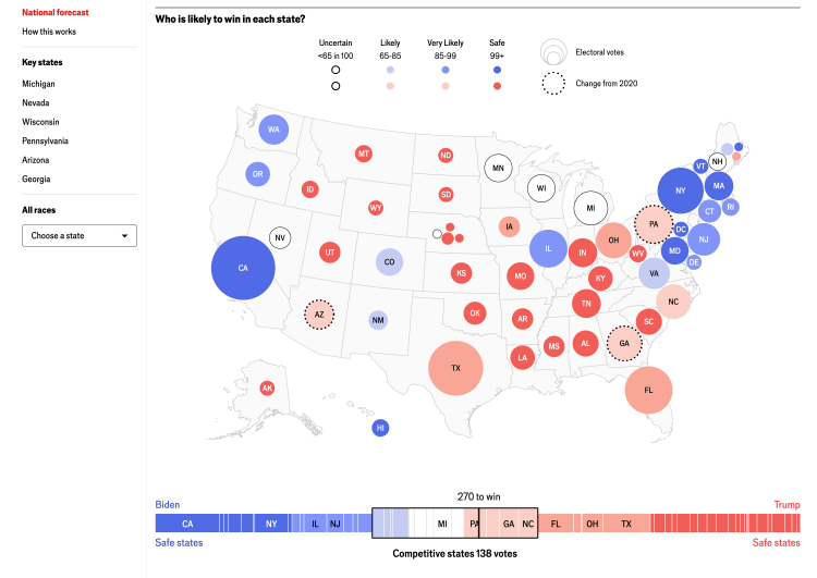
The Economist US election forecast
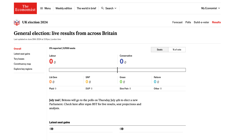
The Economist UK election results
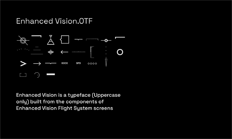
Enhanced Vision.OTF
