China calls the shots in Myanmar's civil war
Follow an oil-and-gas pipeline through three conflict zones
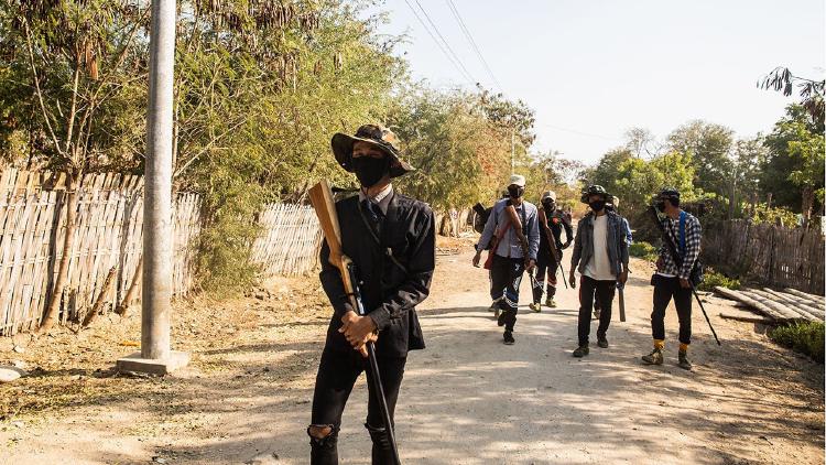
Myself and a few others at The Economist first had the idea for an interactive article covering Myanmar’s civil war last autumn, not long after we finished working on a story about the siege in Sudan, a collaboration with The Economist’s films team. Much like Sudan’s civil war, the struggle in Myanmar involves many different ethnic and political groups that are fighting for a multitude of reasons across many states. We thought a visual approach, using animated maps and photographs, would help us convey the complexity of the situation.
After the idea came the sketches. I started by drafting different versions. Should we focus on Rakhine State, the Arakan Army and the Rohingya and their fight against the military junta? 
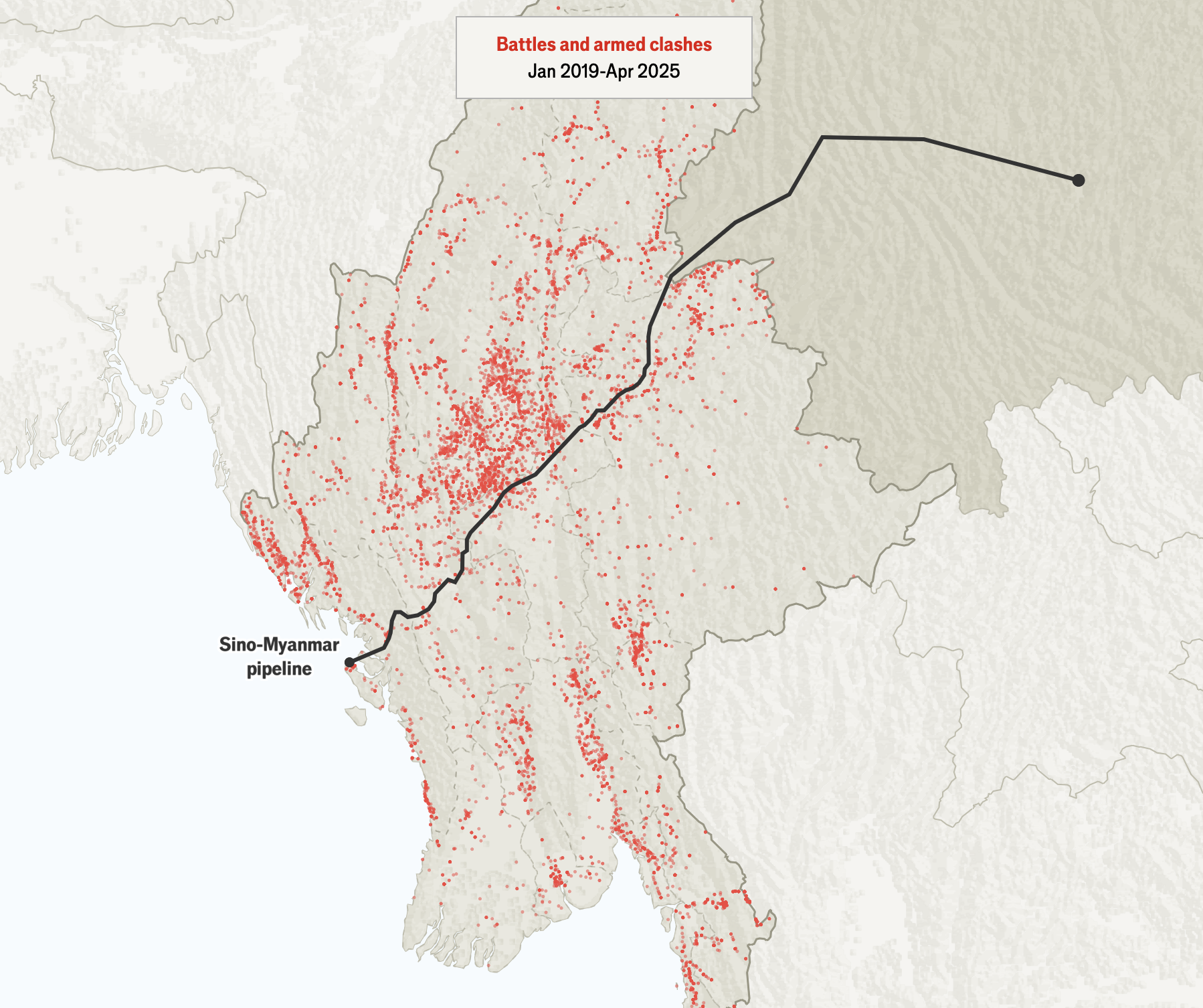
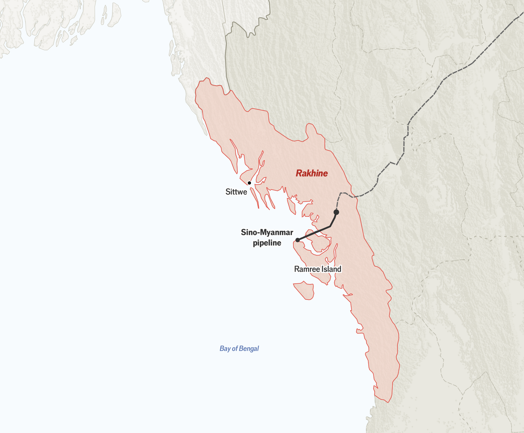
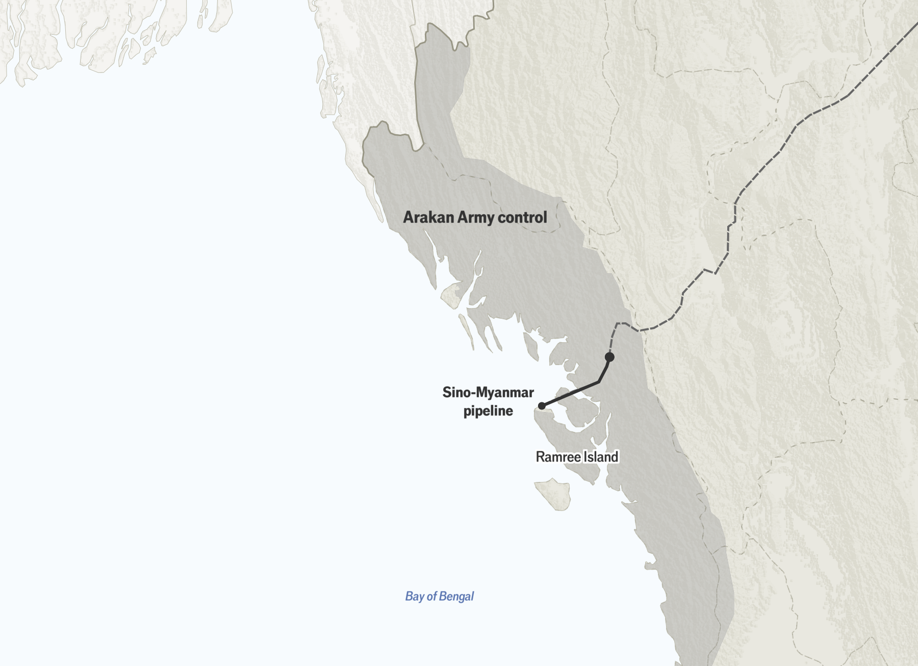
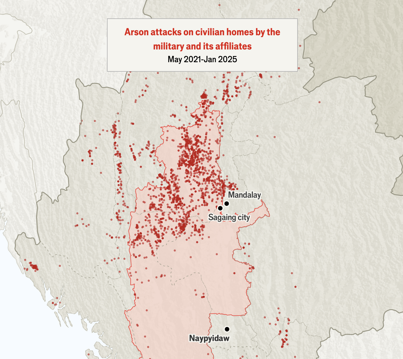
We spoke to experts from the Centre of Information Resilience, an open-source investigation outfit, and then considered focusing on Sagaing, a region that has been subjected to heavy airstrikes and arson attacks by the junta. Eventually we chose to concentrate on a China-operated oil-and-gas pipeline that runs through the country from Rakhine to Shan state. This gave us a unique route into covering the conflict as a whole, while explaining China’s pivotal role.
Unlike the article about the war in Sudan, which had one long scrollytelling component focusing on a specific city, we envisaged the interactive article about Myanmar to be more of a visual essay with individual chapters. Each segment would discuss a state or region along the pipeline that had been affected by the war. We wanted illustrations to divide each section and provide more visual appeal to the piece than just a map (similar to our piece on Chinese migrants). The animated pipeline would act as a link that takes the reader through and connects each chapter. That is why we decided to fix the map on the page and animate it. As the reader scrolls through the article it provides a constant geographical reference point.
The next step was to structure the map, for which I used QGIS. Thankfully the Myanmar Information Management Unit, a UN-funded data bank, provided us with the different state and township boundaries and the rest of the data were obtained from Natural Earth. Once I had the map layers I removed any unnecessary metadata and consolidated most of the map into one base layer to save memory space.
For the labelling, final styling and animation I used Maplibre, an interactive mapping library that we often use for our special projects. It provided the functionality I needed for this project, but it was tricky to adjust labels so that nothing was cut off on mobile.
The most important thing to get right with interactive visual projects such as this one is to structure them so they work well on a mobile screen. For the layout I took inspiration from two of our previous interactive projects—a Christmas-issue special and an article about the demise of an iconic American highway—and broke the text into sections that I layered above the map; as the reader scrolls, the map is revealed.