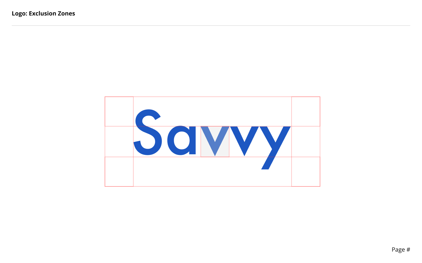
Savvy
Case Study Project - Savvy
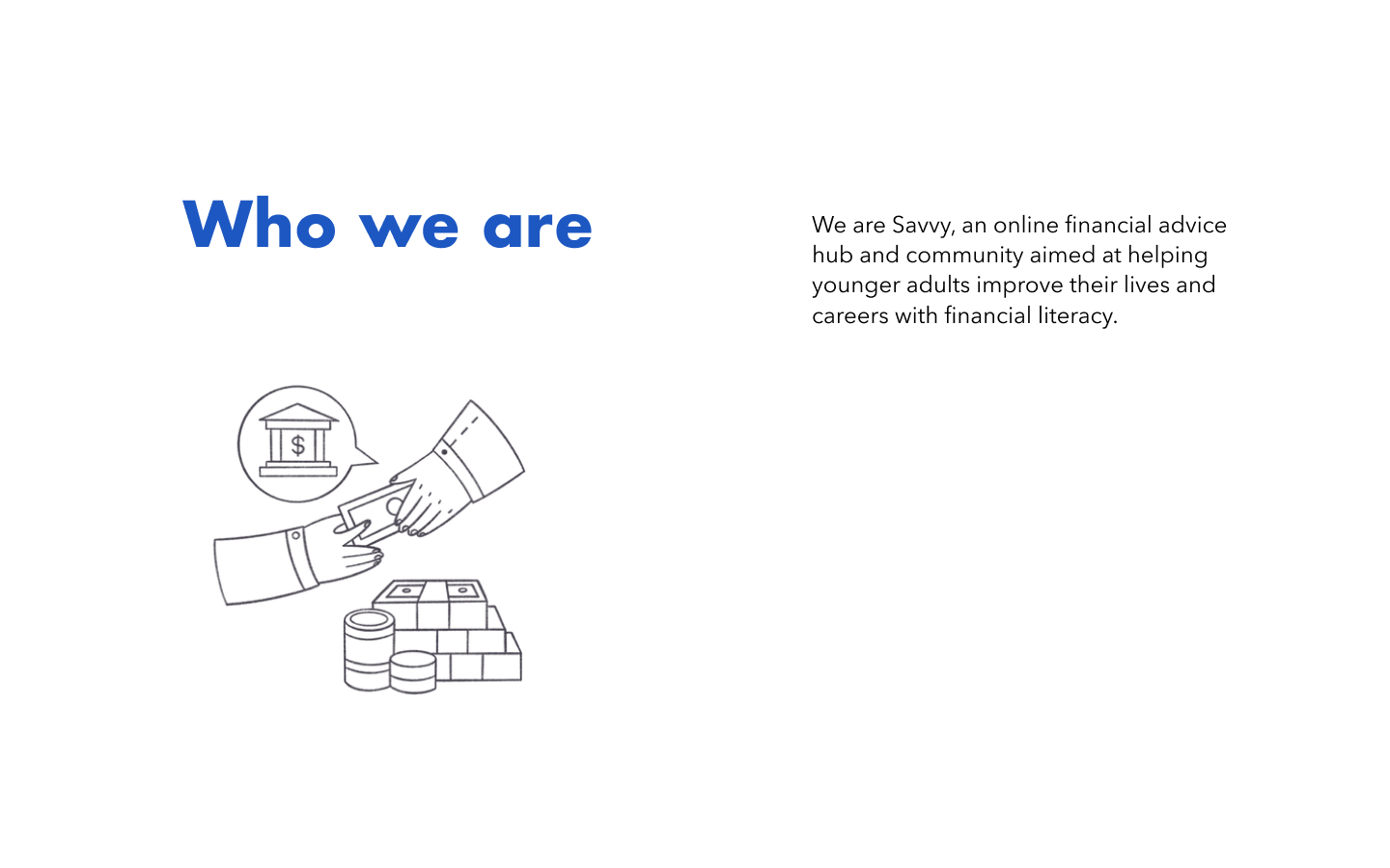
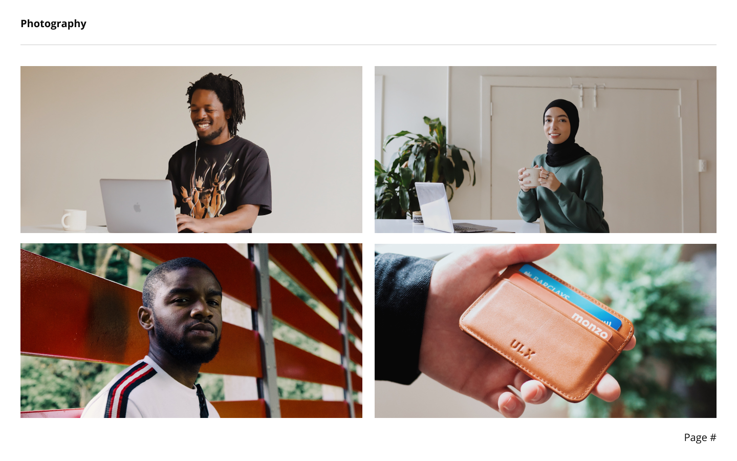
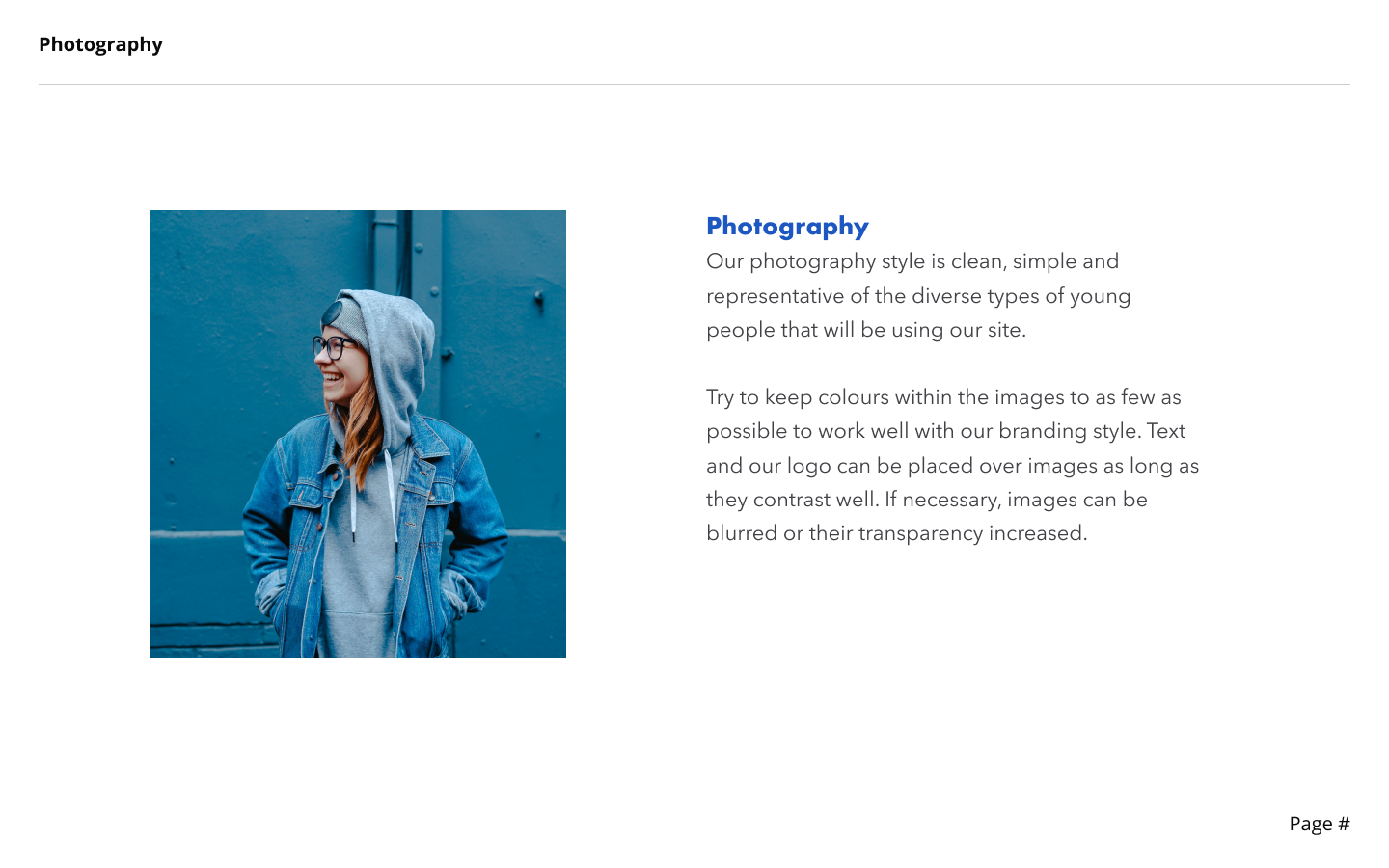
“We are Savvy, an online financial advice hub and community aimed at helping younger adults improve their lives and careers with financial literacy.
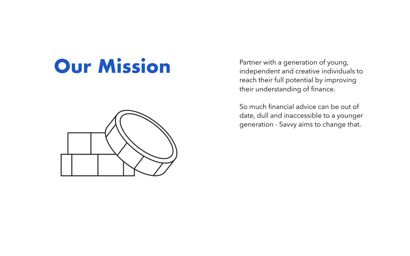
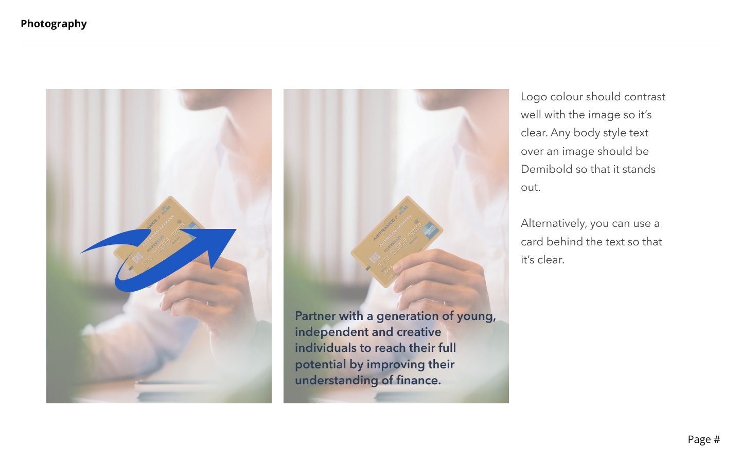
Our Mission - Partner with a generation of young, independent and creative individuals to reach their full potential by improving their understanding of finance.
So much financial advice can be out of date, dull and inaccessible to a younger generation - Savvy aims to change that.”
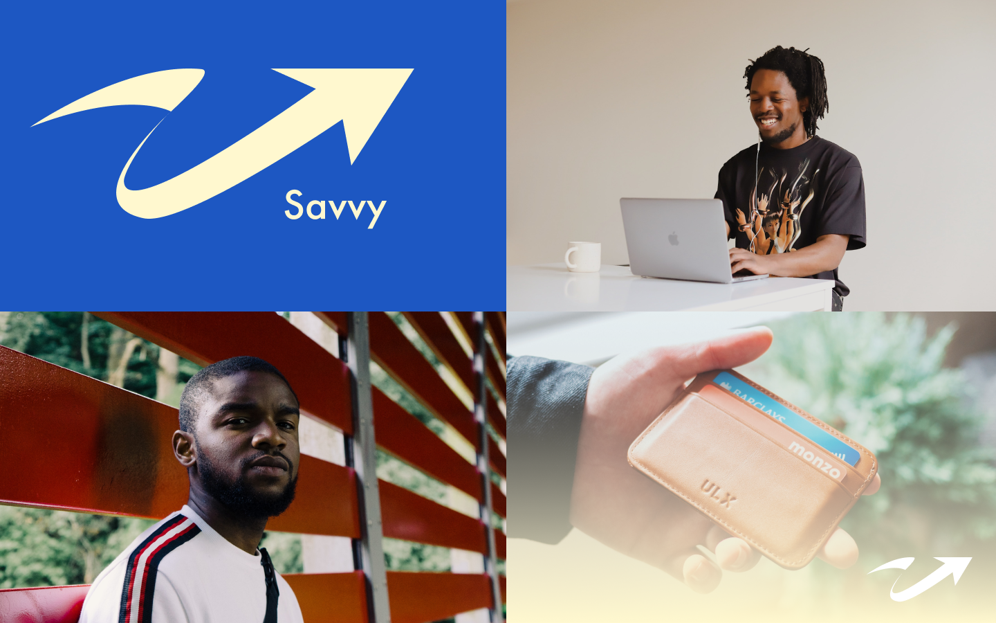
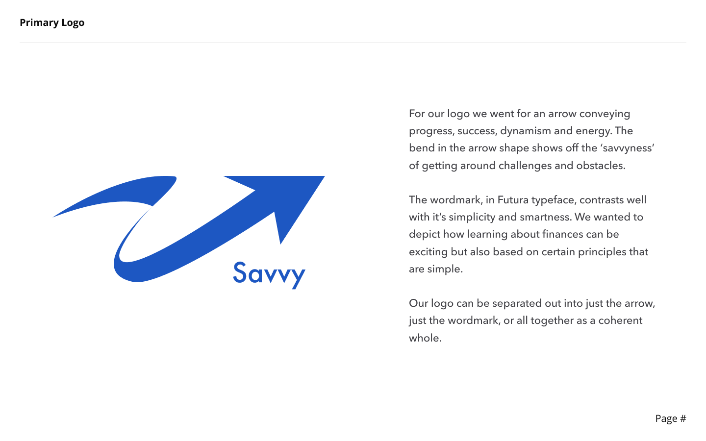
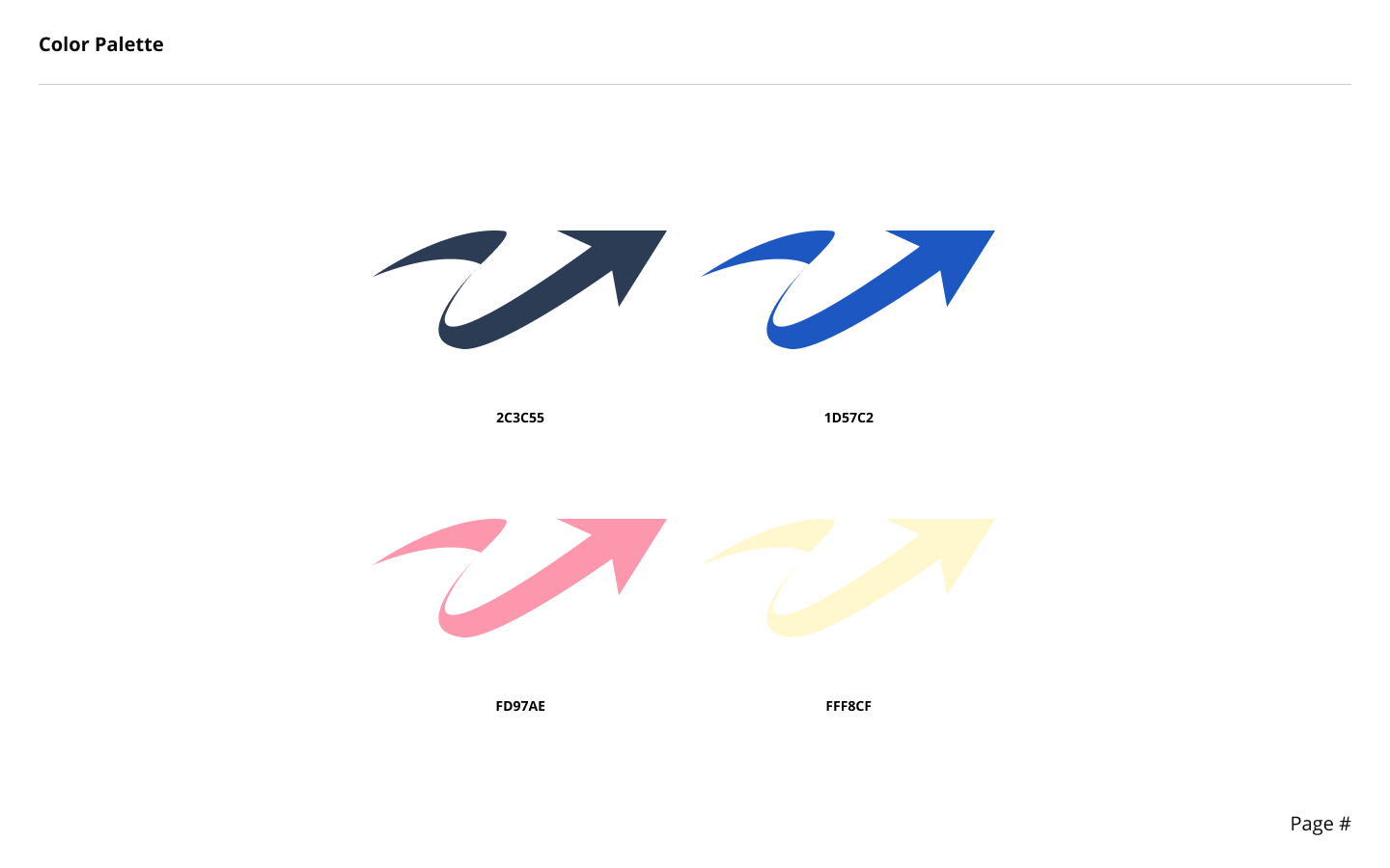
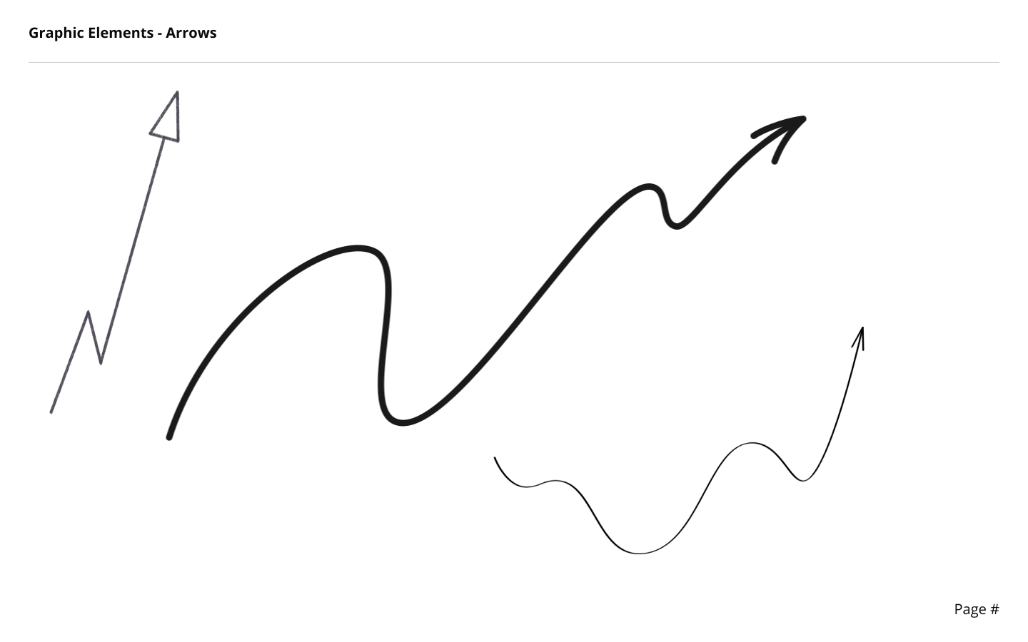
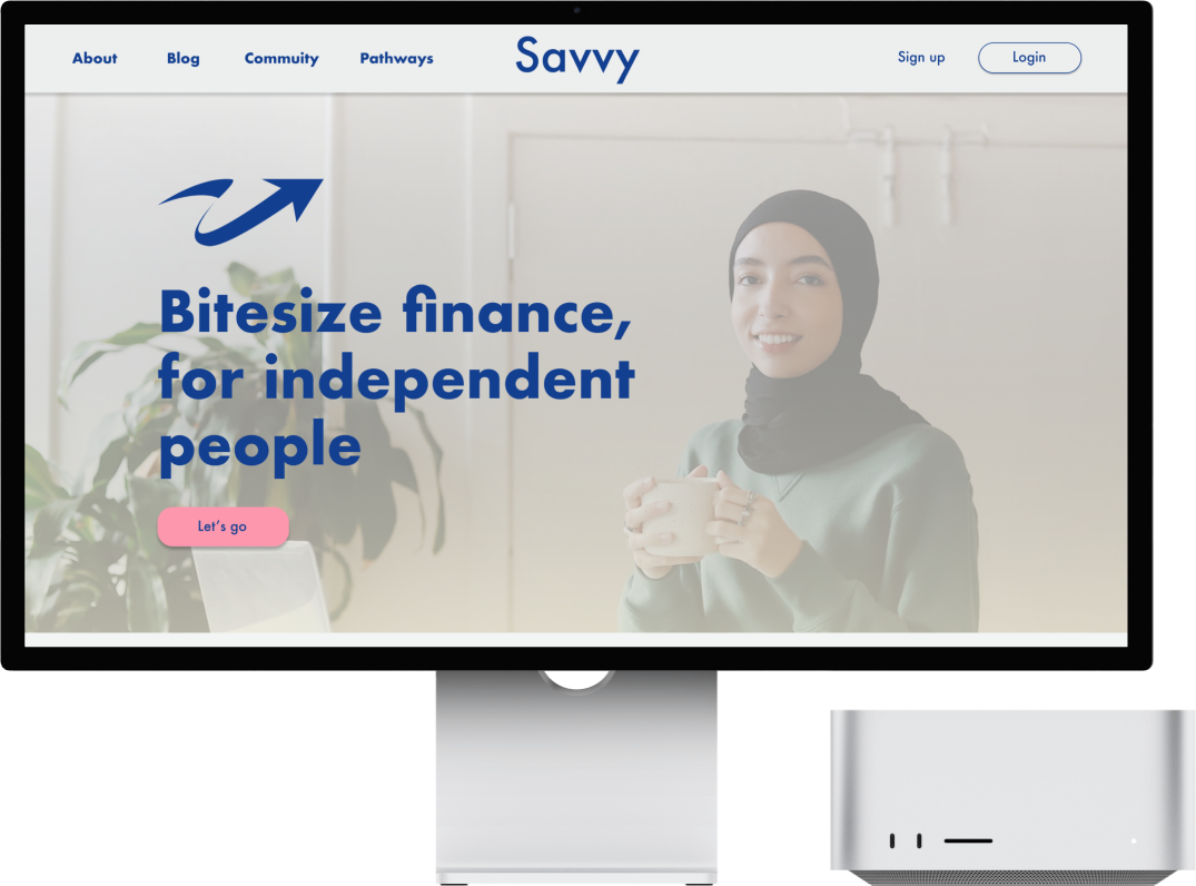
For our logo we went for an arrow conveying progress, success, dynamism and energy. The bend in the arrow shape shows off the ‘savvyness’ of getting around challenges and obstacles.
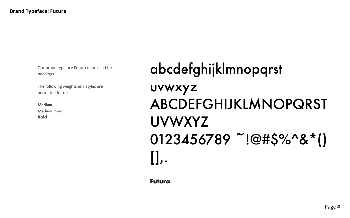
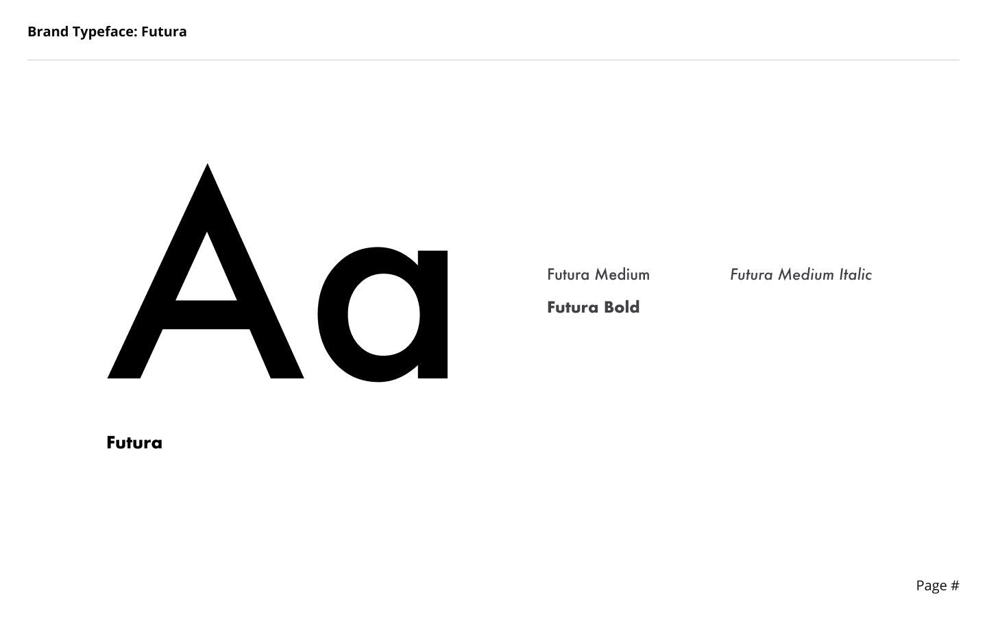
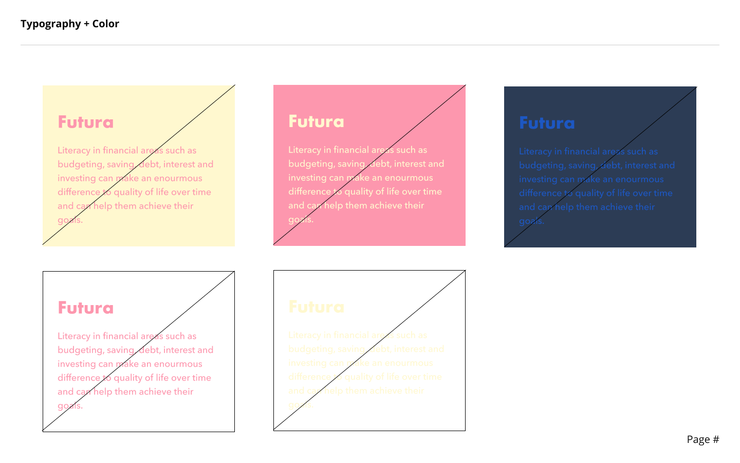
The wordmark, in Futura typeface, contrasts well with it’s simplicity and smartness. We wanted to depict how learning about finances can be exciting but also based on certain principles that are simple.
Our logo can be separated out into just the arrow, just the wordmark, or all together as a coherent whole.