starfish.systems - a tiny design studio
Case Study Project
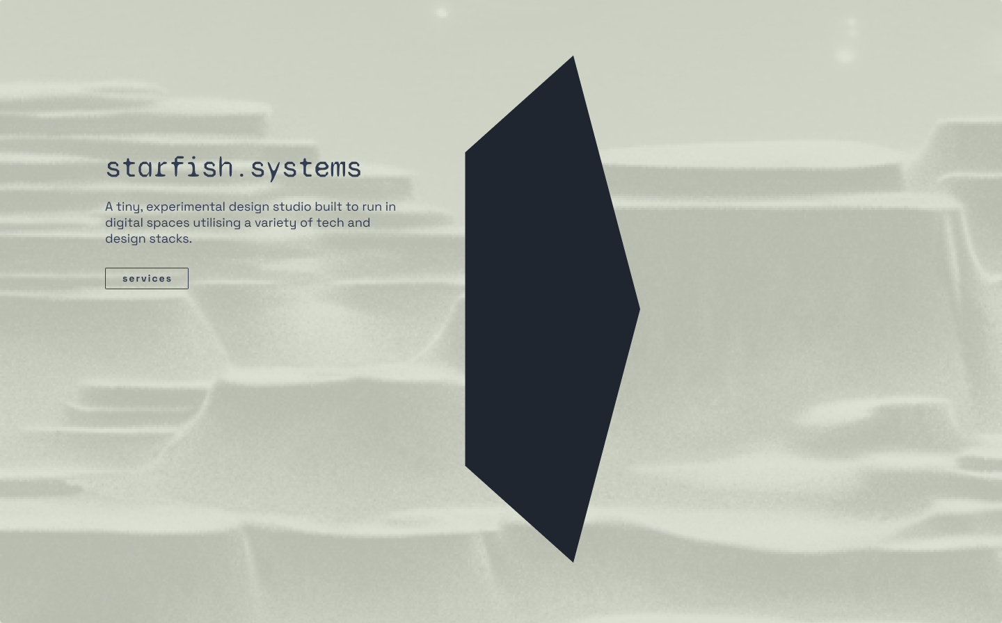
A tiny, experimental design studio activated by Joseph. starfish.systems is designed to run in digital spaces utilising a variety of tech and design stacks.
Mood board and colour palette
First step was to put together a moodboard which I had already partly accumulated on are.na. I was looking for retro, low poly shapes mixed with high tech ‘clean’ sci-fi tech. Based on some images I found I started building my colour palette.
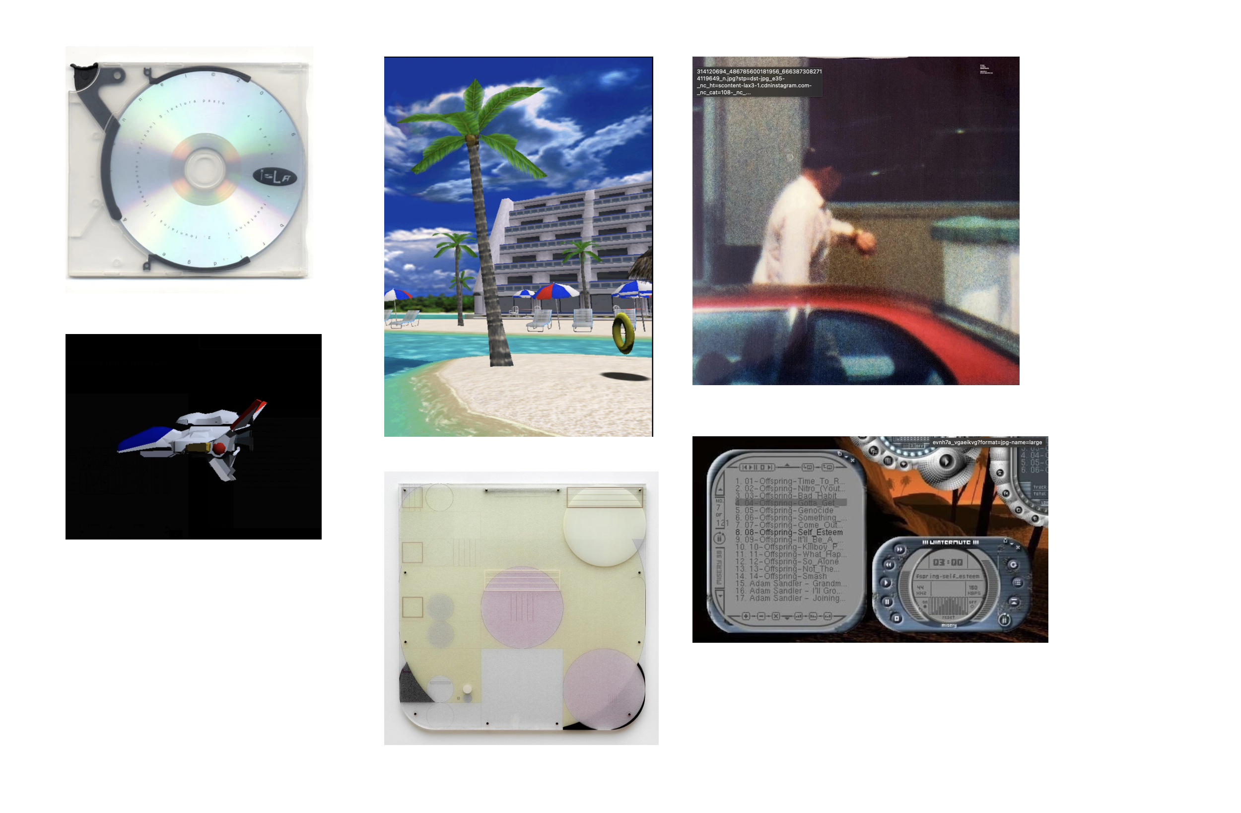
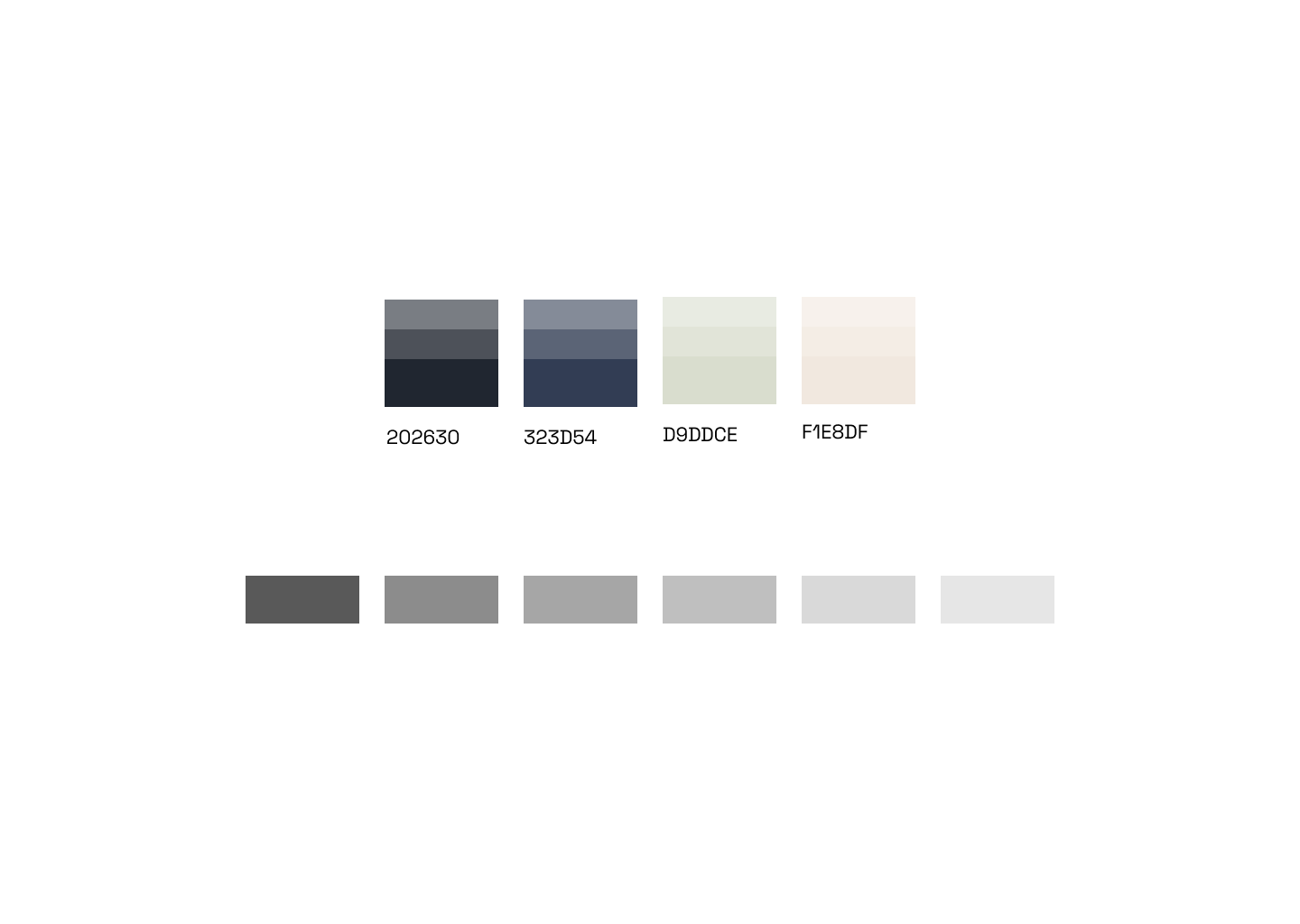
The beige and green worked well together - they had a mossy/sandy tone taken from the ’e-ink display’ screen images from the moodboard and the video game beach scene.
Illustrations
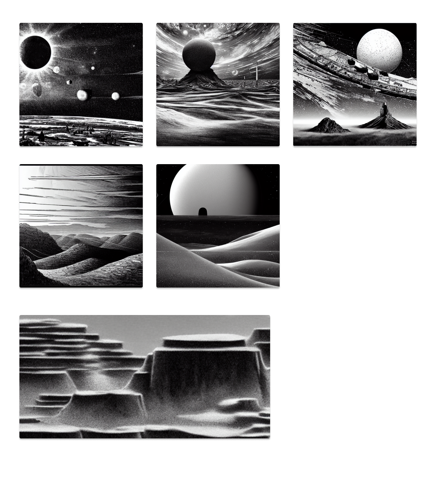
I used an AI image generation plugin in Figma for the first time to create illustrations. Incredible how quickly this field of image generation has developed in the last year and messing around with it here got me excited about how it could be used for creating new looks, styles and inspiration in future projects.
Some prompts I used were ‘sci-fi landscape’ ‘black and white’ ‘desert’ ’low detail’ ‘simple’
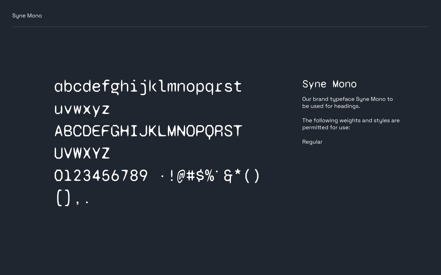
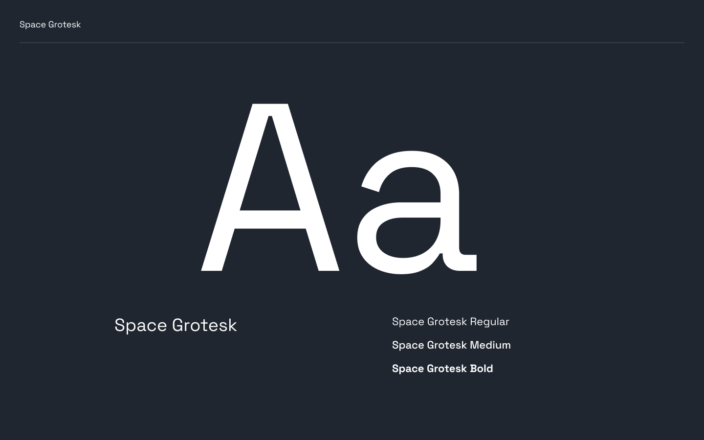
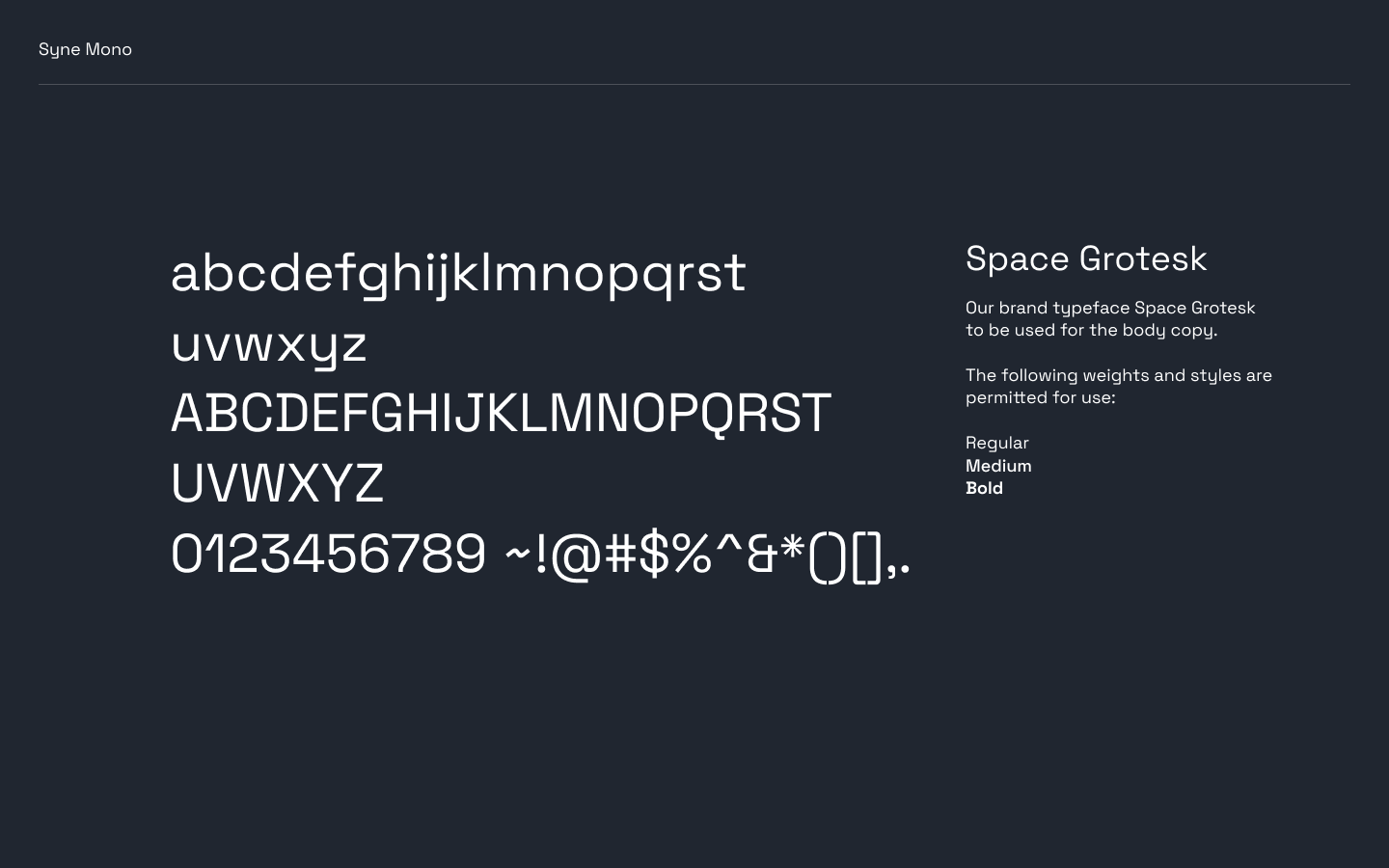
Typography
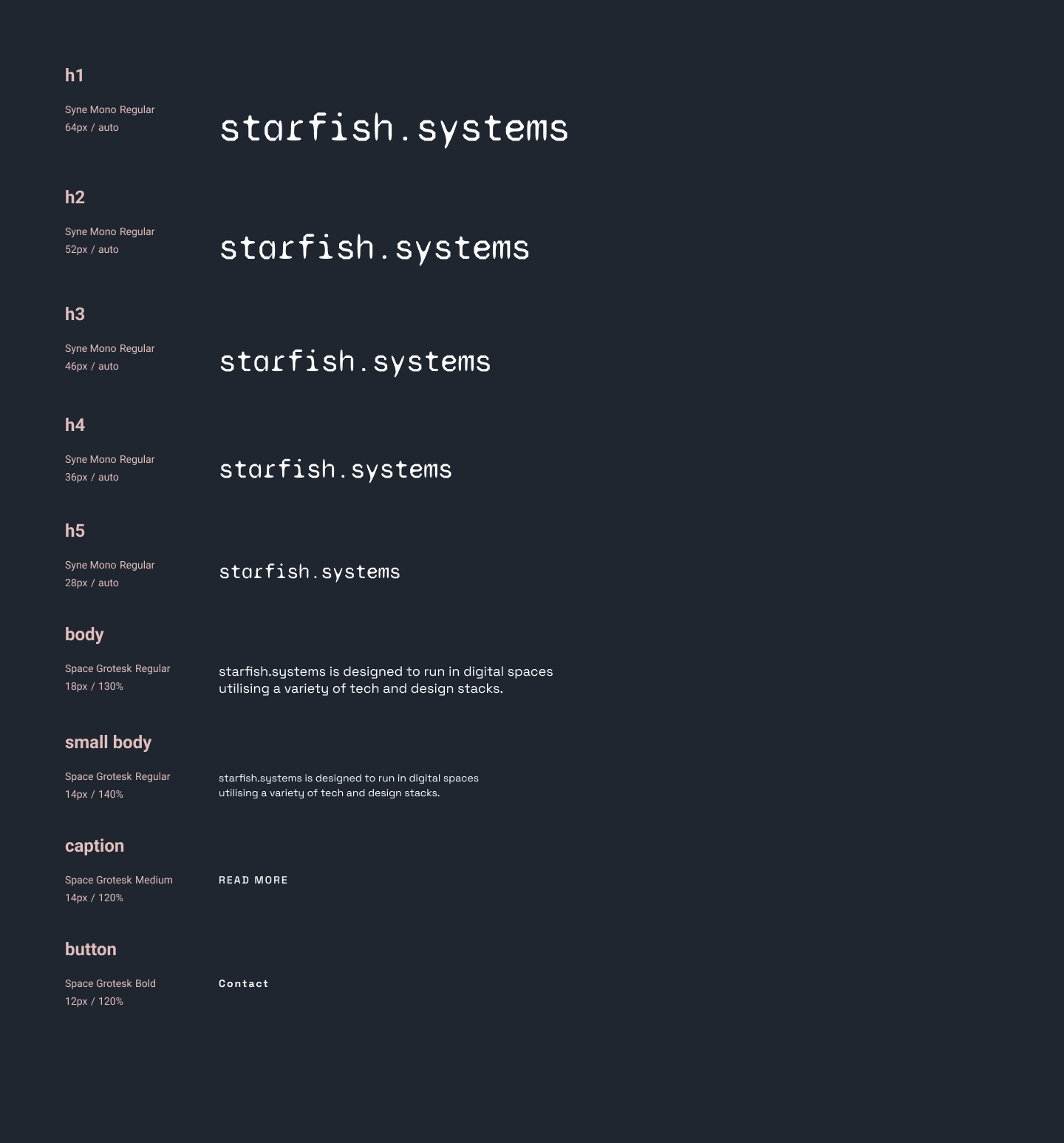
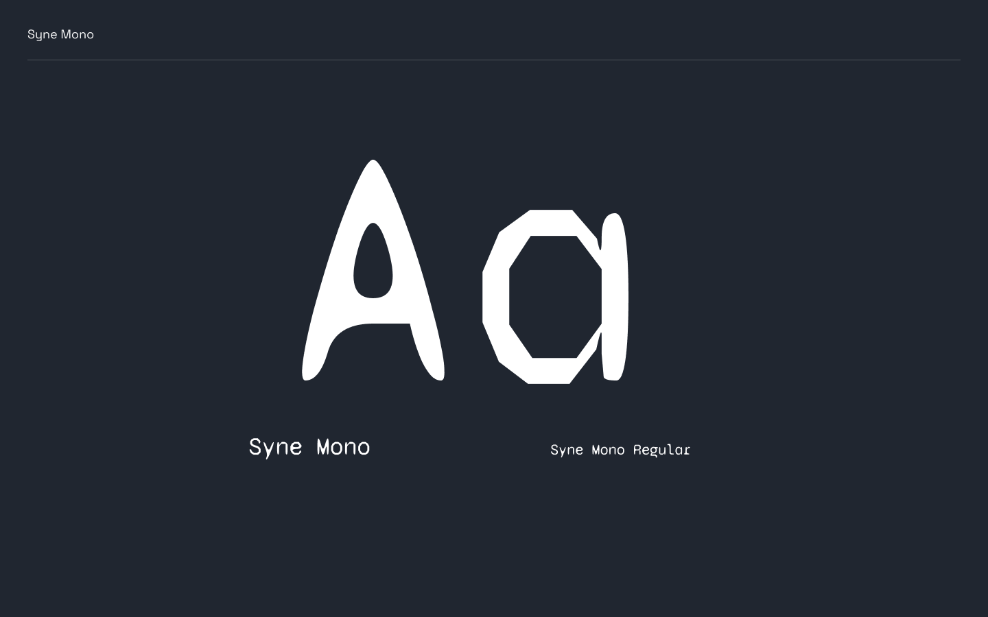
Syne Mono was chosen for it’s low-poly retro, sci-fi style. It’s mixture of sharp and rounded corners made it easy on the eyes and worked well in larger sizes for headers.
Space Grotesk worked great as a body typeface, it was clean, sans-serif typeface that contrased well with Syne Mono and was highly readable in small sizes.
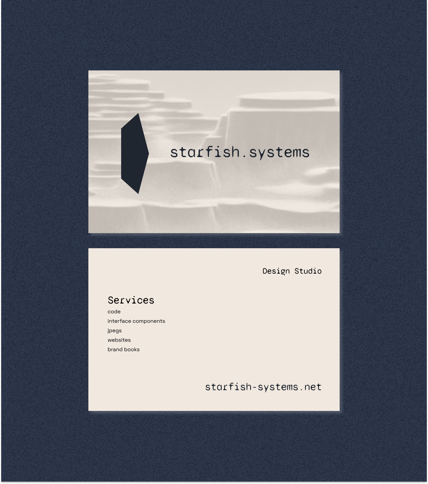
Logo and wordmark
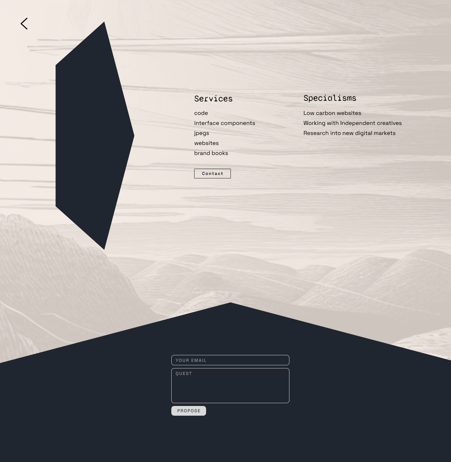
Next was the logo/symbol and word mark. Inspired by retro video games, I wanted a ’low-poly’ shape that looked good solo or with text. After experimenting a bit with different forms I found this pentagon - I thought it looked like a rock or a diamond when turned on it’s side. It also looked like a glitch or fracture, a break in your computer screen - which I liked as the idea of connecting organic matter and tech was a theme I wanted to explore. It also acted as an arrow pointing to the word mark, and could be dynamic component - stretching across the word mark to create a background.
![]()
![]()
![]()
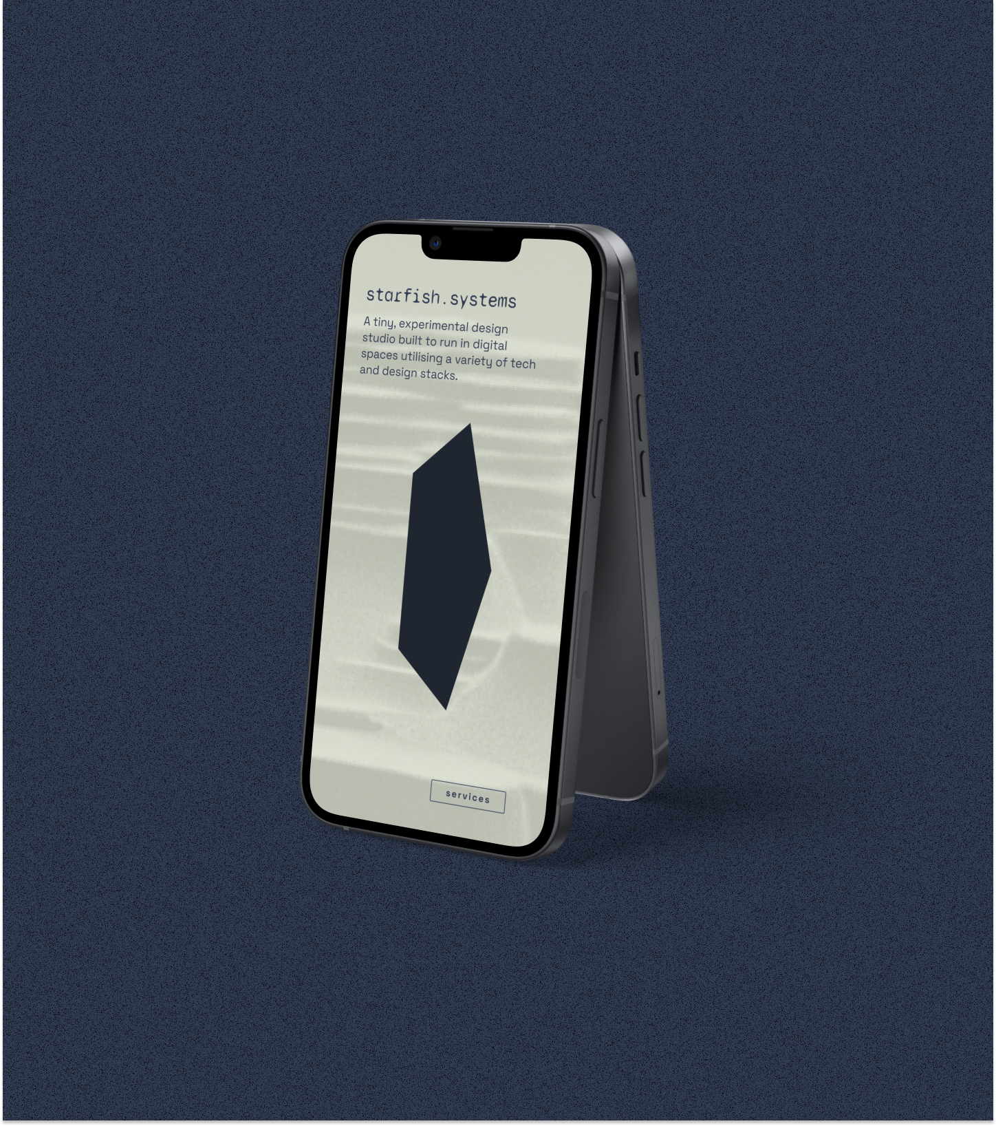
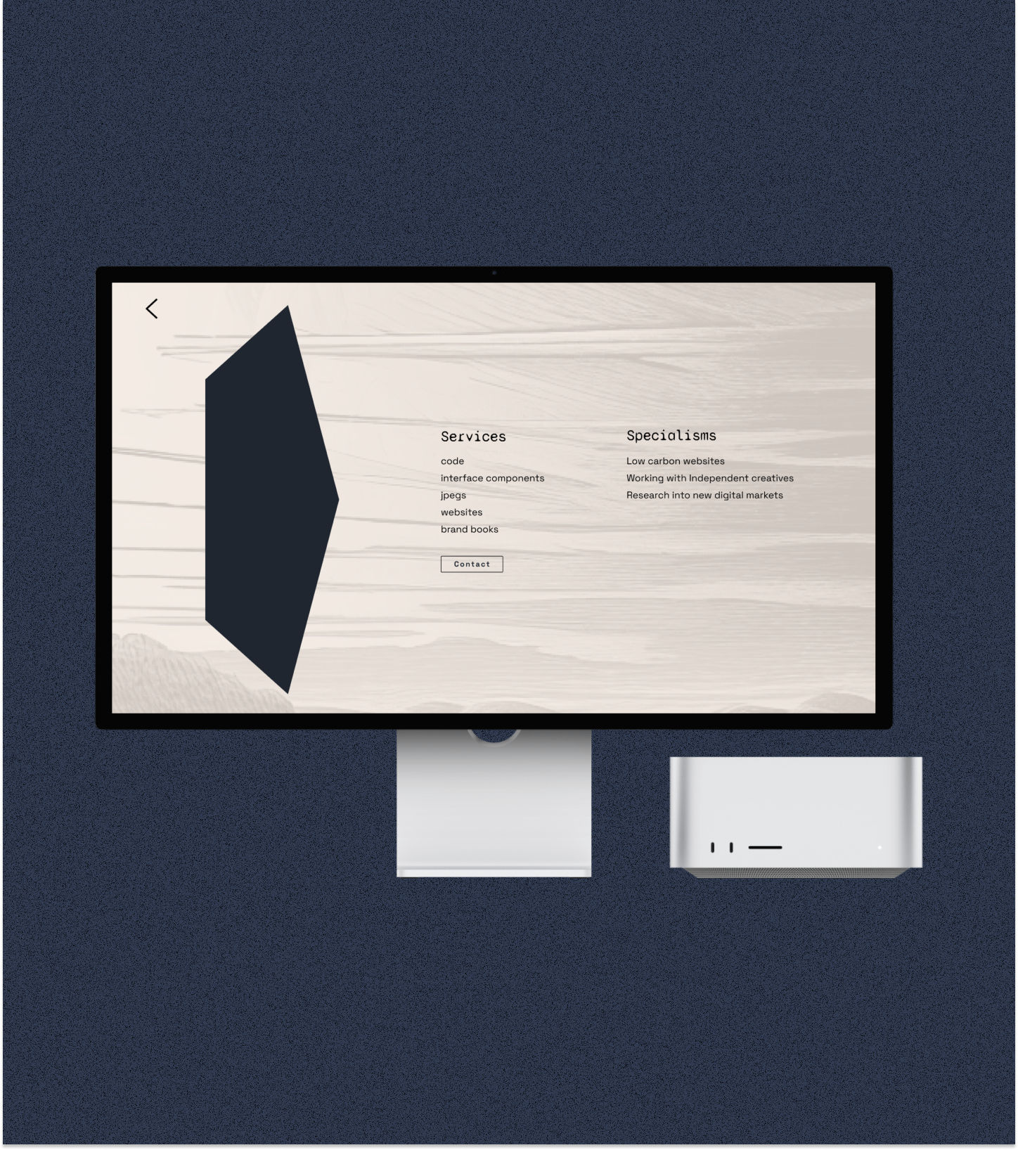
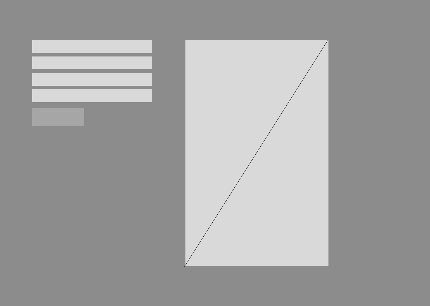
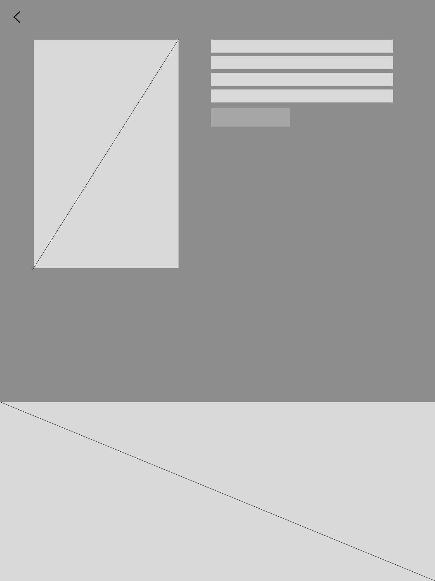
Wireframes and building the site
A couple quick wireframes before building a mockup of the site. The site is very quick to load without any complex animations or javascript and only two pages (home and services). At the bottom is an email contact form for potential clients.
Final mockups